PR Tips: 21 ways images can make or break your press releases

Sending an image with your press release should be common sense – but are you really using photos correctly?
Journalists and bloggers will be more likely to cover news that includes an image. But a terrible image could be just as bad as not including one in the first place.
They’re worth a thousand words so choosing the right picture will give your release an advantage.
1. Hire a professional press photographer
No, a wedding photographer won’t do. Press photographers are ‘media whisperers’ with the power to know exactly what the media is looking for – it’s your best chance for getting suitable photos.
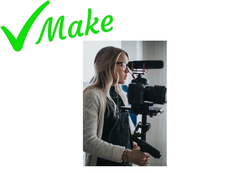
2. Give your photographer a tight brief
Paying for a professional is worthless unless you actually explain what images you need. Identify the subjects of the photo and what the story is about.
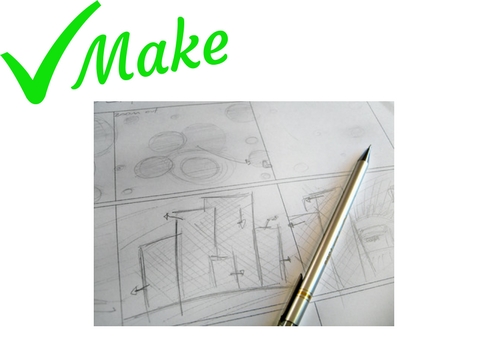
3. Don’t *insert stock title* – it’s boring and says nothing
If you can’t hire a professional due to budget or time restraints, don’t use stock photos instead. Images need to properly illustrate your story.

TIP: You know the story the best so try taking photos yourself
4. Please, no white wall backgrounds
White walls never look white and headshots always end up with a strange shadow.

TIP: Everything is more exciting than a white wall – be creative
5. It’s all about location, location… lighting
Too light and your subject will appear ghostly. Too dark and the subject will be indistinguishable.
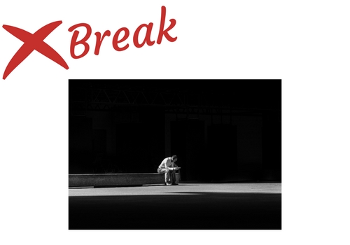
TIP: Outside is brighter but avoid glare from the sun. If you need to take photos indoors, make sure there is adequate lighting and the subject is framed well
6. Convey the right emotions
A story about a stolen favourite garden gnome is never going to work beside a photo the grinning theft victim – surely they should be distraught!

TIP: Remind people why you are taking the photo and natural emotions should kick in
7. Show products in action
Action shots bring products to life – if people can see it in use they can often imagine themselves using it.

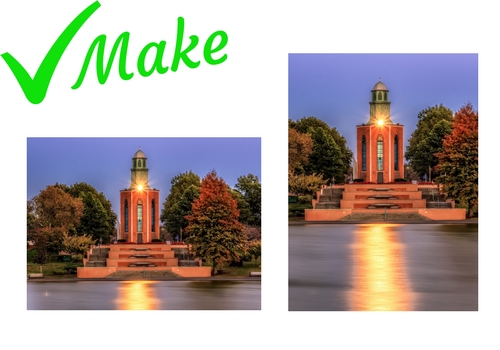
8. Be prepared for all shapes and sizes
Take a landscape and portrait version of the same photo then it will seamlessly fit in any broadsheet, magazine or website layout.
9. Focus
Blurry images won’t do. Neither will images that are centred on the wrong subject.

TIP: Think about what focus of the image is and check the focus is on that
10. The bigger the better
Don’t scale your photos down, use images directly from the camera and make sure they are high-resolution (300dpi or above).
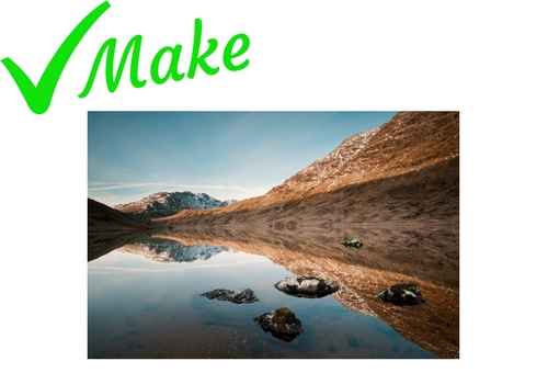
11. Everyone loves the Joint Photographic Experts Group
Also known as the JPEG! Send images as JPEGs – everyone can open them.

12. Don’t incorrectly caption photos – especially names!
Is it Nicholas, Nickolas, Nicolas or Nikolas? – Starbucks may not know but you do.
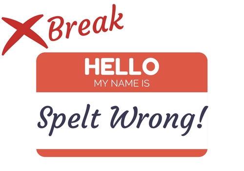
TIP: Check, check and check again – especially with names.
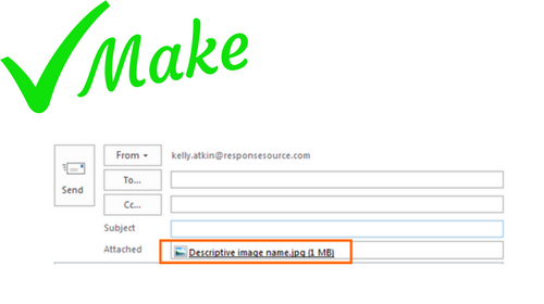
13. Name your image files as descriptively as possible
Company name, people in the photo and the product or subject.
14. Credit your photographer
Photographers deserve love too.

15. Don’t embed images in your press release
They will be small, low resolution and unsuitable for print.

TIP: Either attach one or two photos to the email (remember – high-resolution and JPEG, they should be around 1MB each) or for multiple photos (or larger size images) include a download link
16. Save ‘fancy’ editing for Instagram and go #nofilter
No watermarks, trims, date-stamps and definitely no filters.

TIP: Use the original photo exactly as it is
17. Think about what’s really behind your image
Literally check what’s in the background of your photos. Nobody wants a plant growing out of their head and you certainly don’t want people to see your messy office.
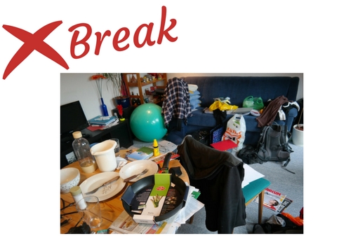
TIP: Check the frame before the photo is taken and check the photo straight after you’ve captured it
18. Always take more photos than you need
Different angles, different backgrounds, different orientation.

19. If you can include a company logo…
Then include a logo. You could take the photo outside the office, in reception areas or by an exhibition stand. Anywhere with a logo or branding works well to associate the company with the news.
20. Try using an infographic
If your story is data driven then an infographic will help to paint a clearer picture.

21. And finally – our Press Release Wire expert Gemma suggests…
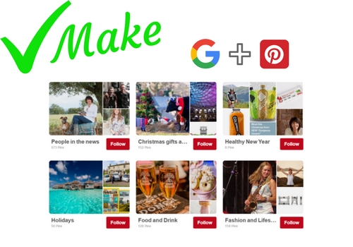
“Images are indexed by Google separately to press releases. It really pays to have your image alongside your news online to gain more views of your content. Many of the images that come through the ResponseSource Press Release Wire also gets posted on Pinterest to give your news even more visibility.”
Any other tips? Let us know in the comments section.


