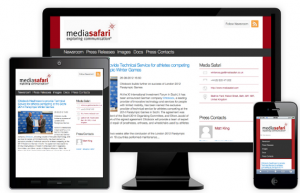
Effective social media newsrooms for the mobile web
Many media organisations are realising the importance of publishing on websites that work well when viewed from any device. They do this using what is known as ‘responsive’ web design techniques. Indeed, Mashable have called 2013 the “year of responsive design“.
The driving force behind the growth in responsive design is the massive shifts in online consumption habits brought about through tablet sales, smart phone usage and widespread wireless internet access. As 4G mobile broadband extends its reach this will add fuel to the trend.
Brands that think like media (and they all need to) are building responsive websites because they help customers view content and merchandise whenever, wherever, and however they like. Ultimately it drives sales.
There is more. Google likes responsive design; it says so on the Google Developers site: “Google recommends webmasters follow the industry best practice of using responsive web design, namely serving the same HTML for all devices and using only CSS media queries to decide the rendering on each device.”
Just like media outlet and corporate websites, dedicated press office pages and social media newsrooms benefit from the universal accessibility that responsive design can provide. Many journalists are early adopters of new technology and they are often highly mobile individuals. This is why we built SourceWire Newsrooms using responsive techniques. One day, maybe, all newsrooms will be built this way.
