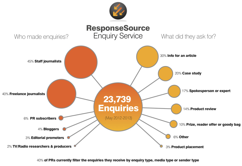
Analysis of journalist requests on ResponseSource – infographic
 A recent post showed there is a strong appetite for analysis of who uses the ResponseSource Enquiry Service.
This infographic (click on the image for a full size version) shows who made media requests and what they asked for (broken down by ‘request type’) for the year until the beginning of May 2013. This is an analysis of nearly 24,000 requests from journalists and other content creators.
Looking at ‘who’, staff journalists make up the majority with 45 per cent. They are followed closely by freelance journalists with 40 per cent. So clearly journalists represent by far the largest group of enquirers at 85 per cent.
Bloggers represent four per cent of requests, behind PR subscribers with six per cent. These two types of enquirer generate the most critical feedback from subscribers. While many like to get requests from bloggers and appreciate their value, sometimes the perceived quality of their requests comes under question. Others see less value in requests from other ResponseSource subscribers (though it must be said that whenever we have surveyed our customers the majority have come out in favour, so we have retained this option). It is worth noting that both of these types of enquirer together still only represent one in 10 of all requests.
Moving onto what people ask for on ResponseSource, 30 per cent of requests are for information for an article, which to me is what the service was primarily designed for when we introduced it back in 1998 and is still the most common type of request. Personal case study requests represent 20 percent, 17 per cent are requests for spokesperson or experts and 14 per cent are for review product. The enquiry types that raise most eyebrows among subscribers are the product related ones – products for review, placement, reader-offers, give-aways or goody bags – as there is a perception that some of these come across a bit like ‘blagging’. Altogether these represent 21 per cent of all requests and will be the subject of a following infographic.
A big message here, and I must confess pointing this out is one of the main reasons we have published this data, that as a subscriber you can filter enquiries – for example by selecting enquirer and enquiry types listed above that you don’t want to get – to suit your needs (see our recent improvements to ResponseSource enquiry filtering). So far, four out of ten PR recipients of ResponseSource requests have set up filters.
What do you think of this data? Does it match your experience of ResponseSource?